
Comparing Map Projections: Mercator vs. Eckert IV
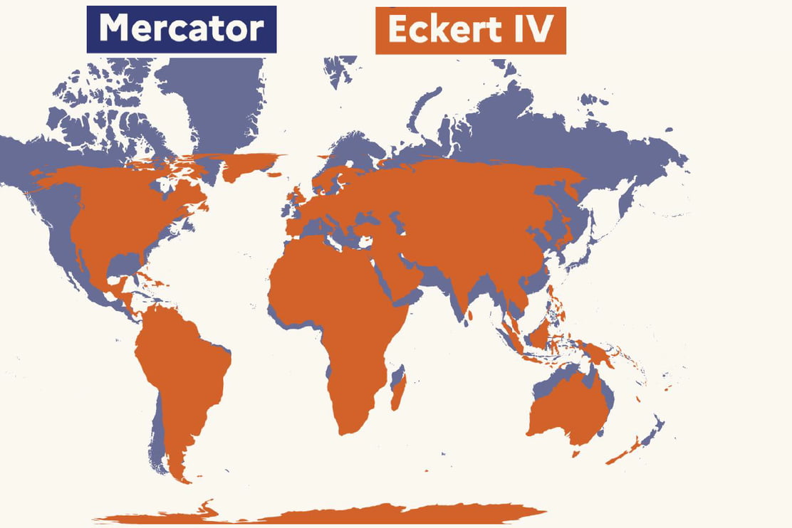
This visual comparison highlights the differences between the Mercator and Eckert IV map projections. The Mercator projection, shown in blue, is known for preserving angles but significantly distorts the size of landmasses as they move away from the equator, making regions like Greenland and Northern Europe appear much larger than they are. In contrast, the Eckert IV projection, shown in orange, is an equal-area map projection that provides a more accurate representation of the relative sizes of continents and countries. The overlay demonstrates how landmasses like Africa and South America appear significantly larger in the Eckert IV projection compared to their stretched counterparts in the Mercator view.


people obsess way too much over projections when it is literally just a tool for navigation, not a political manifesto. if you need a map to tell you how the world works you are already missing the
honestly i just stare at this until my brain hurts because i still can't wrap my head around how different they actually look 😵
I fucking hate Mercator and everything it stands for. Why would you just present a "wrong" map for the sake of visual appeal? Just show it like it is, we'll be ok.
the french are known to be wrong about many things.
Yeah, why am I even surprised, I should have expected morons believe Mercator is a biased racist map projection. We are fucked.
yay, we traded area distortion to angular distortion, progress! it's as if projecting a globe to a plane is not inherently lossy.
So if Africa is that big why allow them entry into tiny Europe?
Why the quotes? Mercator indeed stretches some areas 10 fold.
No matter how much you modify the map, Africa is still going to be a shithole.
Good thing to show better that Africa doesn't fit into Europe, as some pro immigration hippies want to believe
No map is good for all purposes, that said, I do like the french way. Nobody navigates the seven seas in 2D maps anymore, let maps show sizes acurate is a good idea
They only did it because England look smaller in the Eckert 4 projection.