
The Unfortunate Typography of a Signage Design Choice
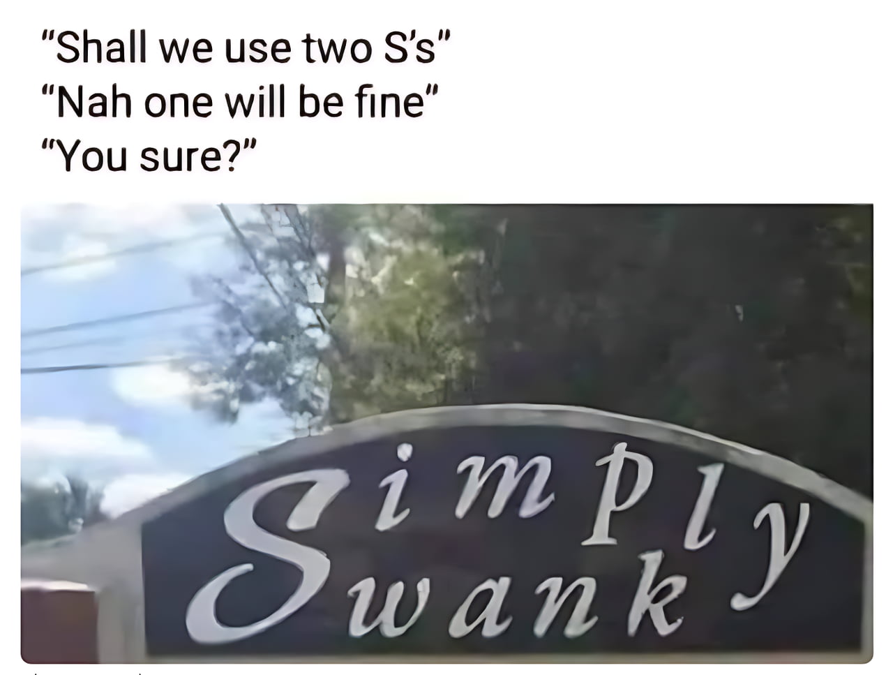
This image highlights a humorous design oversight on a sign for a business or location named 'Simply Swank.' The text above the image suggests a conversation between two people debating whether to use two 'S' characters in the design. Because the word 'Simply' is positioned directly above 'Swank' and the 'S' in 'Swank' is stylized in a large, prominent font, the visual result inadvertently creates an unintended and suggestive word. The meme points out how poor font choice and layout can drastically alter the intended meaning of a brand name.
I'm not sure I know a complicated method...
8 Imply wank
That's challenging.
God wills it!!!
The sign implies wank
If you insist.
Imply swank
What's the other option? wtf is swank?
Ok don't ask me twice
Simp Wankly Wank Simply