
Visualizing Data: A Critique of Infographic Design
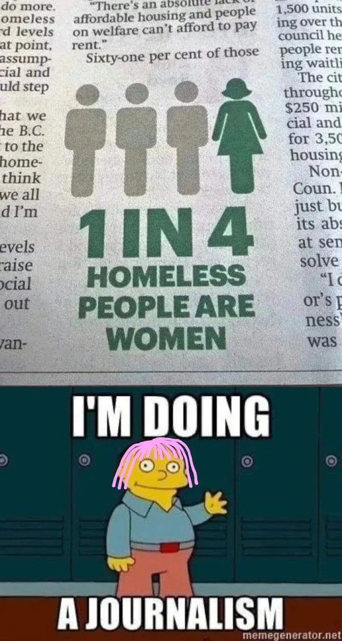
This image highlights a common pitfall in data visualization by juxtaposing a newspaper infographic with a meme. The infographic states that '1 in 4 homeless people are women' using a graphic of four figures, where three are grey and one is green. However, the visual representation implies that 75% of the population is male and 25% is female, which is a standard way to represent a ratio. The meme below features Ralph Wiggum from The Simpsons with the caption 'I'm doing a journalism,' suggesting that the infographic's design choice is misleading or poorly executed in its attempt to communicate the statistic effectively to the reader.



This is exactly why I failed my statistics class in college.
I am so confused why they thought this was a good idea for a chart
Is it really that hard to just use a simple pie chart?
This is exactly why I never trust those random newspaper charts lol
My brain literally refuses to process charts like this lol
I feel like the designer definitely failed basic shapes class.
This is exactly why I stopped trusting random charts on the internet 💀
This is exactly why I failed my statistics class
This is exactly why design matters, the visual is so misleading
Graphic design is my passion but this is just painful to look at