
Visualizing the Frequency Distribution of English Letters Within Words
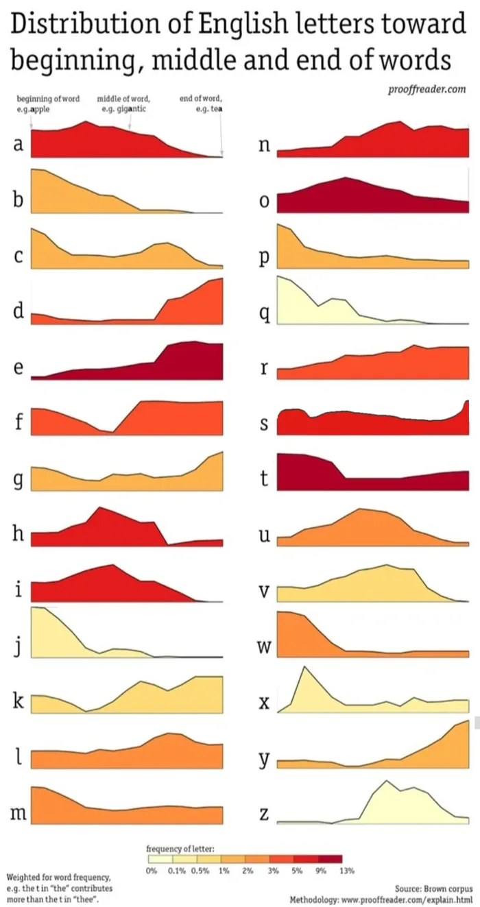
This infographic illustrates the statistical distribution of every letter in the English alphabet based on its typical position within a word—whether at the beginning, middle, or end. Using data from the Brown Corpus, the charts show how specific letters like 'b' and 'j' are heavily weighted toward the start of words, while others like 'd' and 'y' appear more frequently toward the end. The visualization provides a unique linguistic perspective on English orthography, highlighting how letter placement varies significantly across the alphabet. It serves as an interesting reference for those curious about the structural patterns of the English language.

Engineer.
I don’t know why I needed this but thank you.
First conceiled meme I see
Faukin saddam is already here
Antifunny jokeless slop.
He's everywhere ...
"bajmouvzedy" - the most English word according to the statistic
These stats brought to you by the past.
I ssssssee what you did there
Found Saddam!