
Visualizing the Long-Term Rating Decline of The Simpsons
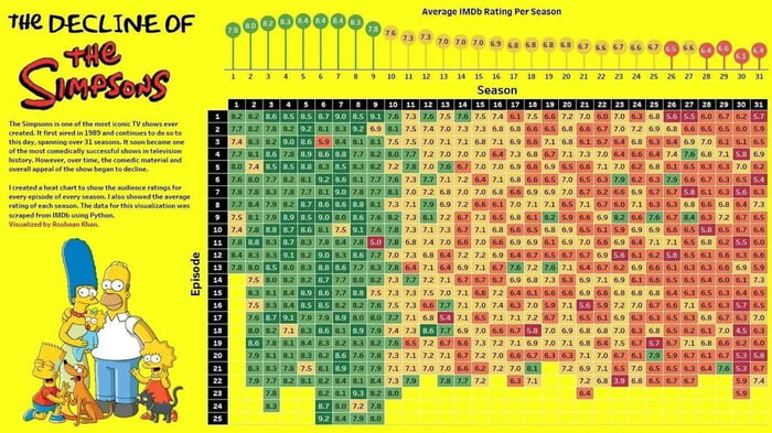
This data visualization tracks the critical reception of The Simpsons across its first 31 seasons. Created by Roshan Khan using IMDb data, the heat map displays individual episode ratings alongside the average score for each season. The chart highlights a clear trend: the show's early years, particularly seasons 3 through 9, maintained consistently high ratings represented in green. As the series progressed into later seasons, the color shift toward red indicates a gradual decline in audience reception. The graphic serves as a quantitative look at the long-running animated sitcom's evolution and the shift in viewer sentiment over three decades of television history.
This only shows the increased hate on the internet. Back then people were still talking about the things they like. Nowadays people talk about what they hate. Telling what you like is a risk.
What happened at s6 e3 ?
Recent episodes have been trash for sure.
10 years later new generation started watching it and they were lil sick fucks who has no idea from joke. Another 10 years new sick fucks were worse.
I bet there was more Lisa in seasons 10+ One of the most boring characters ever
Lenny = white Carl = black
I didn't make it to season 12. I guess that makes sense now.
It's lisa and Marge woke show now
It got worse and then it got woke. Sanitized. No more jokes about Apu. No more strangling Bart.
We're at season 38, grampa.