
Poorly Designed Awareness Campaign Creates Unintended Message
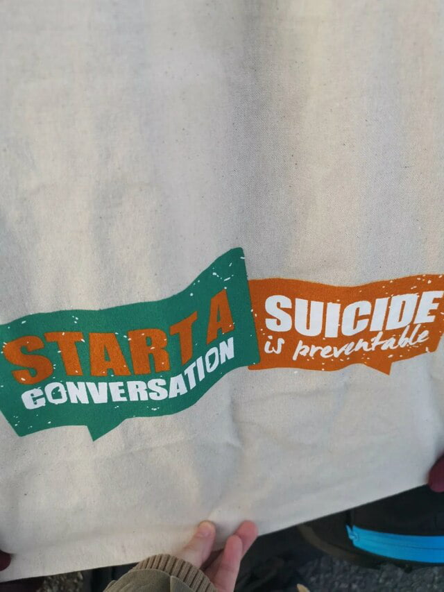
A photograph of a tote bag features a graphic design intended to promote mental health awareness, but the layout leads to an unfortunate misreading. The design uses two speech bubbles: one green with the text 'START A CONVERSATION' and one orange with 'SUICIDE is preventable.' Due to the placement of the words and the overlapping color scheme, the text can be read sequentially as 'START A SUICIDE,' completely subverting the intended message of the campaign. The image highlights how poor typography and layout choices can inadvertently change the meaning of public service messaging.
There's lots of things that's more practical than suicide, I don't know why people take most lame way out, there are countries who send immigrant soldiers to die fighting
Perfect whahaha
That is the one thing I would like to do!
Could you call me a little later?
Don't Dead open inside
Excuse me sir, do you know when the next train comes by?
Don't talk. Take action.
"Hey let's talk!" *Jumps from the window*
'Start A Suicide' is definitely an effective way to prevent conversation, but it's something you can do only once. Murder is something you can do many times.
I too prefer to avoid conversation