
A Visual Comparison of the Nesquik Bunny's Evolution
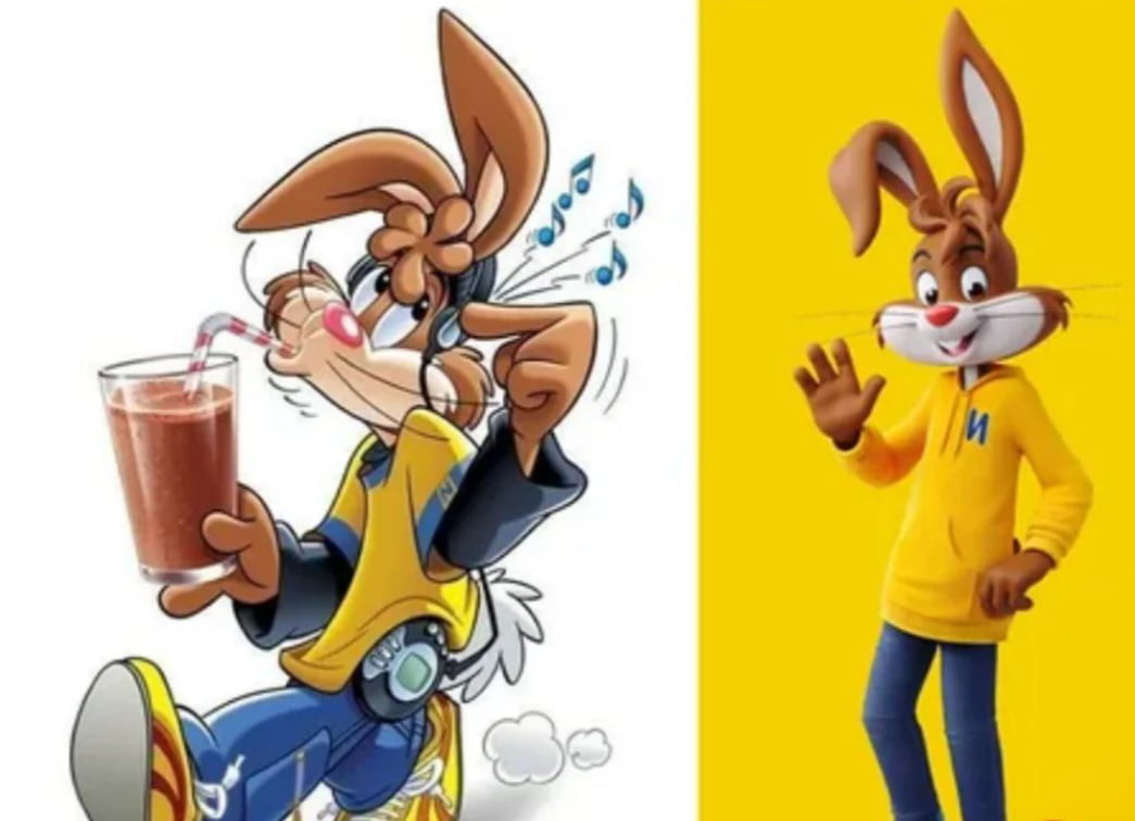
This image provides a side-by-side comparison of the Nesquik Bunny mascot across two different eras of design. The left side features a classic, hand-drawn illustration of the character wearing headphones and carrying a portable music player while enjoying a glass of chocolate milk. The right side displays a modern, 3D-rendered version of the character, depicted in a more simplified, upright pose wearing a yellow hoodie. The contrast highlights the shift from the dynamic, detailed 2D animation style of the past to the cleaner, more minimalist aesthetic often seen in contemporary corporate branding.

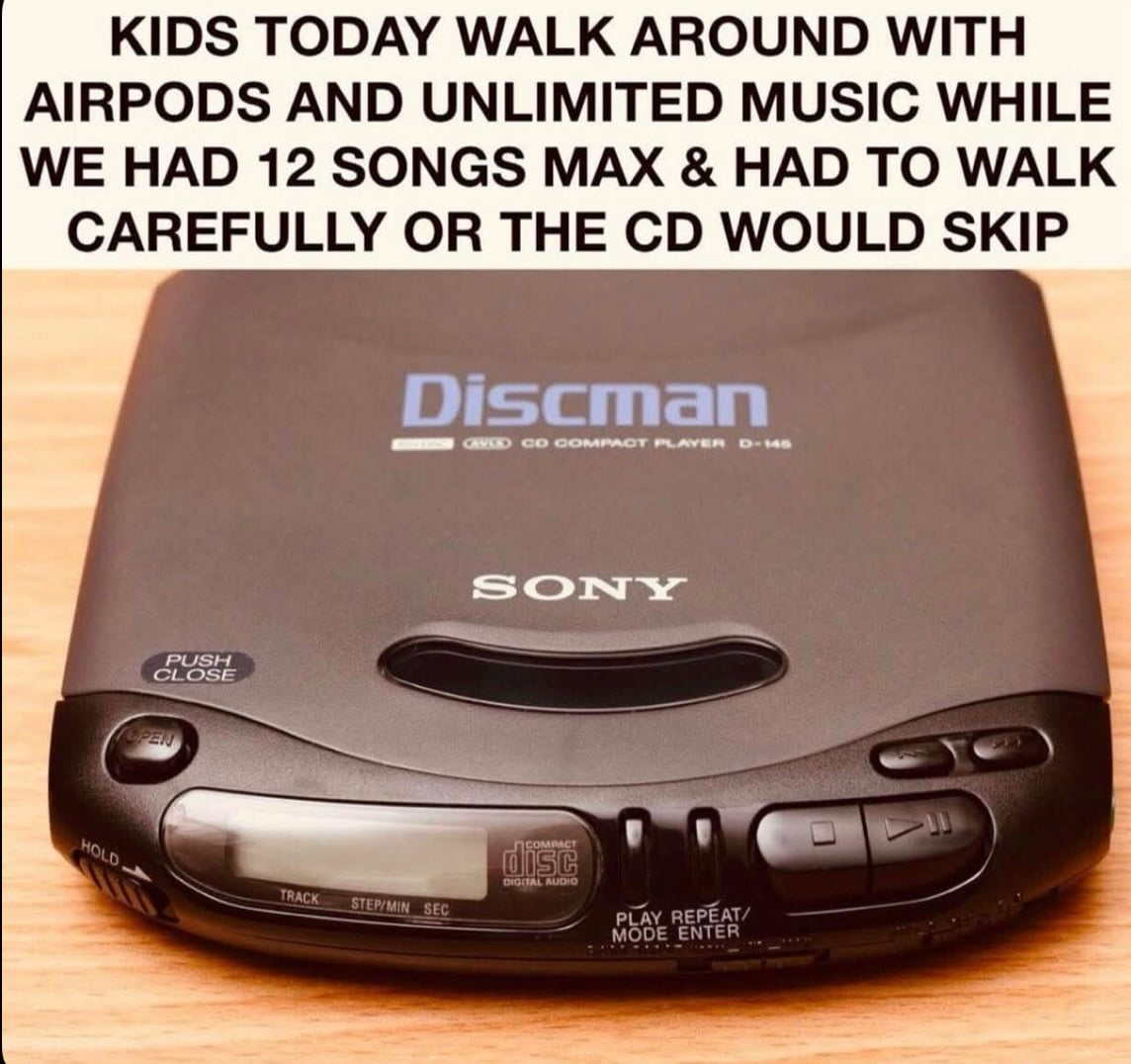
Why would you think the left one is cooler?
Huh, I wonder why does he has an "N" on his.................... ooooOOoOOooOoOOOhhhhhHHHHH!!!!
You were younger, that's all
soul vs soulless, i.e. corposlop
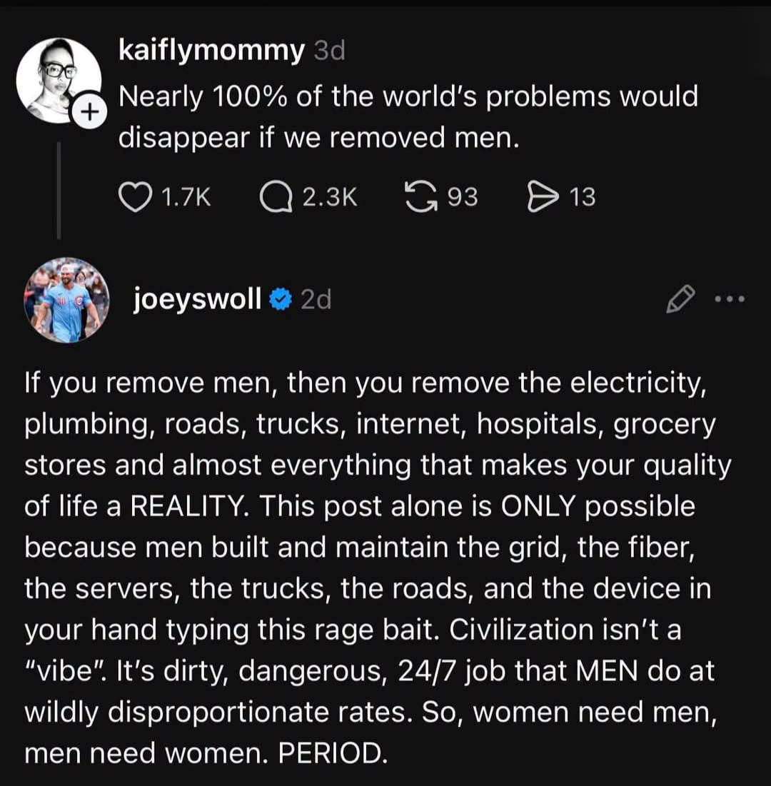
because today there would be too many people who are offended by the old version
You supposed to use it with soy mink now.
He looks like he gave up the clubs and the drinking to settle down in the suburbs where he goes for not-too-fast jog every Saturday morning.
Never forget
The Media / we didn't have to dance around everyone's trigger's and minorities only got their share in the media they actually represented in the population. That's why we / artists could expressive our thoughts and ideas more. And also we were 25 years younger, teens, kids.
Looking at the two images. In the first we see a cartoon depicting strong personality and individuality, loose, causal action pose, detailed and specific clothing choice, the character is engaged drinking while listing to music, even the player has strong individuality. It is mar