
A Humorous Look at Global Measurement Systems
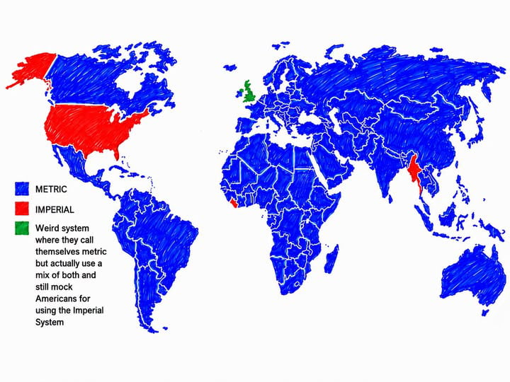
This hand-drawn world map illustrates the global adoption of measurement systems with a satirical twist. While most of the world is colored blue to represent the metric system, the United States, Liberia, and Myanmar are highlighted in red as countries primarily using the imperial system. The United Kingdom is uniquely colored green, labeled with a humorous description of a hybrid system where metric and imperial units are used interchangeably, despite the country's official metric status. The map serves as a lighthearted commentary on the complexities and inconsistencies of international measurement standards.


The USA is on the metric standard, we singed on to it in 1975 or so. We just don’t use it. The citizens just said fuck that and here we are
You can put Canada in greeb too. I'm pretty sure they will agree with me.
In the USA, some things are metric, some things are not - just like the UK. But we all order beer in pints - that's the sophisticated and appropriate way...
Well the americans use metrics and they even don't know about it, imperial is so good that need metric to be physics valid. Without it they dont even have physical definition for it.
USA is metric, but does hang on to some of the old measurements in daily use . The metric conversion act says SI units are preferred but not mandatory.
As a person that used to translate american blueprints. You should yeet that shit it makes you bad at counting.
Not true. Imperial is widely used in Canada
Canada should be green
Nay nay... we use both, interchangeably. Depends on our mood, weather, moon phase, level of drunkenness.
Canada is green too